

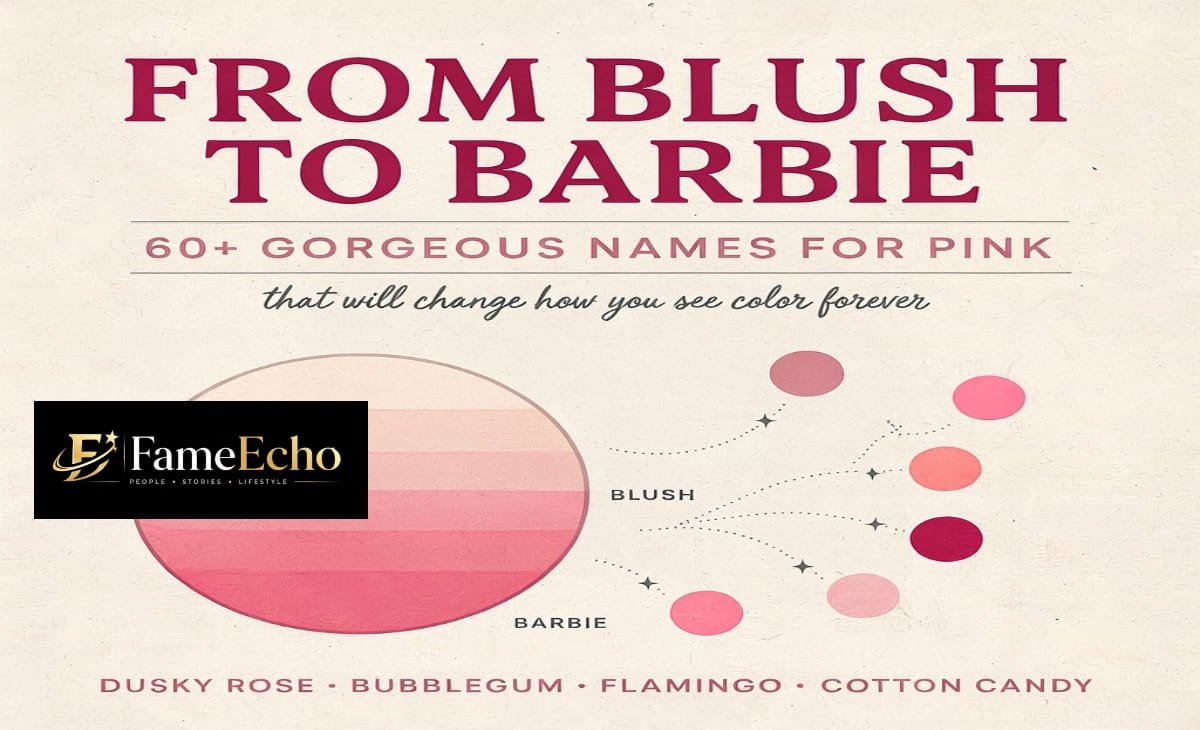

Pink is one of the most versatile, expressive, and beloved colors in the entire spectrum. Furthermore, it is one of the few colors that carries meaning across virtually every culture on earth. From the palest blush on a morning petal to the boldest neon magenta of a city billboard, pink encompasses a breathtaking range of tones. Yet, surprisingly, most people only know a handful of names for this color. Whether you are an artist, a designer, a writer, a fashion enthusiast, or simply someone who loves pink, expanding your vocabulary for this hue can truly transform how you see and describe the world around you.
In addition to that, knowing the right name for a shade of pink can make you more precise in your communication — whether you are ordering paint, describing a dress, or writing a poem. Therefore, this guide explores over 60 names for pink, organized by family, with descriptions of what makes each shade distinct, where you might find it in nature or culture, and how to use these names effectively.
Why Pink Has So Many Names
Color naming is deeply tied to culture, history, and perception. To begin with, pink as a standalone color category is relatively modern — in many older languages, it was simply called “light red.” Moreover, the English word pink itself comes from the flower Dianthus plumarius, commonly called the pink, whose fringed petals gave the color its name in the late 17th century.
Since then, painters, dye-makers, fashion houses, interior designers, and marketers have consequently coined hundreds of names to capture the precise feeling of a particular shade. As a result, the world of pink has grown enormous — and naming it matters deeply, because a name shapes how we perceive and remember a color. Furthermore, research in color psychology shows that named colors are remembered more accurately and recalled more vividly than unnamed ones.
Quick Facts Table
| Fact | Detail |
| Origin of the word “Pink” | Named after the Dianthus flower in the late 17th century |
| Total named pink shades | 60+ documented names |
| Most popular pink | Blush (bridal & interior design) |
| Most iconic cultural pink | Barbie Pink (Pantone 219 C) |
| Oldest pink pigment use | Red ochre mixed with white chalk or calcite (prehistoric cave art) |
| First synthetic pink dye | Mauve (1856, by William Perkin) |
| Pink in nature | Flamingos, peonies, sunsets, coral reefs |
| Most Googled pink shade | Hot Pink |
Pale and Pastel Pinks
These are the softest members of the pink family — quiet, romantic, and often associated with tenderness, infancy, and spring. Moreover, pastel pinks are among the most universally appealing shades across age groups and cultures.
Blush — Perhaps the most widely recognized name for pale pink. It mimics the rosy color that rises in the cheeks. Furthermore, blush is warm, slightly peachy, and carries an air of understated elegance. As a result, it has become a staple in bridal fashion and minimalist interior design.
Ballet Slipper — A faded, dusty pink with a hint of beige. Named for the soft leather shoes worn by ballerinas, this shade is graceful and muted, never showy. In addition, it pairs beautifully with ivory and champagne tones.
Pearl Pink — A very light pink with a silvery or iridescent quality, similar to the inner surface of a shell. Moreover, it carries a luminous quality that makes it popular in jewelry and cosmetics packaging.
Petal — Evocative of flower petals, this is a clean, bright yet light pink. It feels fresh and natural, like a rose in full bloom. Additionally, it works exceptionally well in spring-themed designs.
Seashell — A warm off-white with a faint pink blush, mirroring the inside of certain mollusk shells. Furthermore, seashell is a barely-there pink, perfect for soft, airy aesthetics and minimalist interiors.
Baby Pink — The classic pale pink associated with newborns and nurseries. It is soft, sweet, and universally gentle in character. However, in contemporary fashion, it has also been embraced by adults as a statement of softness.
Powder Pink — A cool, matte pink reminiscent of face powder or talc. It has a dry, sophisticated quality that, consequently, reads as more grown-up than baby pink despite a similar lightness level.
Rosewater — Named for the delicate liquid distilled from rose petals, rosewater pink is faintly warm and translucent-feeling. As a result, it is particularly popular in skincare branding and spa aesthetics.
Fairy Tale Pink — A dreamy, almost lavender-kissed pale pink that suggests magic and whimsy. It sits on the cusp between pink and lilac, making it therefore ideal for fantasy and children’s illustration work.
Crystal Rose — A cool, glassy pale pink that evokes clarity and refinement. Moreover, it is frequently used in luxury product branding to suggest purity and exclusivity.
Medium and True Pinks
These are the pinks most people picture when they close their eyes and think of the color itself — neither too light nor too dark, vivid without being harsh. In fact, these shades represent the heart of the pink color family.
Rose — The quintessential medium pink. Named directly for the flower, rose pink is warm, slightly red-toned, and carries centuries of romantic symbolism. Furthermore, it is one of the oldest and most enduring color names in the English language.
Carnation Pink — A bright, cheerful pink named for the ruffled flower. It is slightly lighter than rose; however, it carries a joyful, uncomplicated energy that makes it ideal for celebratory designs.
Flamingo — A vivid, warm pink with an orange undertone, inspired by the feathers of the flamingo bird. Moreover, it feels exotic, playful, and bold without crossing into neon territory.
Bubblegum — A sugary, saturated pink reminiscent of chewing gum. Bubblegum pink is fun, youthful, and unabashedly sweet. Additionally, it has strong associations with pop culture and the 1950s diner aesthetic.
Taffy — Similar to bubblegum but slightly warmer and more peachy, like pulled candy. It has a nostalgic, fairground quality and, as a result, works wonderfully in retro-themed design projects.
Punch — A vivid, fruity pink inspired by the bright color of fruit punch drinks. It is energetic and eye-catching; therefore, it is frequently used in summer marketing campaigns.
Watermelon — A fresh, juicy pink with a hint of red and sometimes a whisper of green undertone. It is instantly associated with summer and, furthermore, has become a widely used color in tropical and resort fashion.
Tickle Me Pink — Originally a Crayola crayon color, this medium bright pink has since crossed into everyday vocabulary. It is lively and lighthearted, making it consequently a favorite in children’s products.
Hot Coral — Bridging the gap between pink and orange-red, hot coral is sun-warmed and vibrant. Moreover, it has been a dominant color in resort and summer fashion for decades.
Amaranth — A deeper, reddish pink named for the amaranth flower and plant. It has an ancient, literary quality — in fact, amaranth was used metaphorically for immortality in classical poetry.
Peony — Lush and full-bodied, peony pink mirrors the garden flower’s layered blooms. Furthermore, it has an opulent, romantic depth that makes it a top choice for luxury wedding design.
Deep and Rich Pinks
As pink deepens, it approaches fuchsia, magenta, and raspberry — colors with dramatic presence and high energy. These shades, therefore, command attention wherever they appear.
Fuchsia — Named for the fuchsia flower, this is a vivid, electric pink with a strong blue or purple undertone. Furthermore, fuchsia sits right at the border of pink and magenta and has been a major fashion color since the 1960s.
Magenta — Technically, magenta is a printing and light color that sits between red and violet. In everyday use, however, it refers to a bold, saturated blue-pink that feels modern and graphic. It was named after the Battle of Magenta in 1859.
Raspberry — A deep, cool pink with a slight purple cast, like the berry it is named for. Moreover, raspberry is sophisticated and slightly tart in personality — confident rather than sweet.
Cerise — From the French word for cherry, cerise is a vivid, bluish-red pink. Furthermore, it was a fashionable color in 19th-century Europe and consequently retains a sense of Continental elegance today.
Cranberry — Deeper than raspberry, cranberry is a rich, red-purple pink with a wintry, autumnal mood. As a result, it is popular in holiday fashion and warm-toned interiors.
Mulberry — A dusty, muted deep pink with significant purple tones, like the fruit of the mulberry tree. It feels moody, vintage, and artistic; therefore, it is a favorite in bohemian and Victorian-revival aesthetics.
Wine Rose — The color of rosé wine held to the light — deep enough to be serious, yet bright enough to be festive. Additionally, it pairs beautifully with gold and copper metallics.
Berry — A broad family name for any deep, saturated pink-purple. Moreover, berries in general lend their name to a range of rich, fruity shades widely used in autumn color palettes.
Hibiscus — A vivid, jewel-toned deep pink inspired by the tropical flower. Furthermore, it is bold and sun-drenched, popular in Caribbean and Pacific Islander aesthetics.
Claret Rose — A dark, wine-adjacent deep pink with a dignified, mature character. As a result, it is often chosen for formal and evening wear contexts.
Neon and Electric Pinks
These are pinks that glow, vibrate, and refuse to fade into the background. They emerged as significant cultural colors in the 1980s and, notably, have never fully gone away since then.
Hot Pink — The most famous electric pink. Hot pink is loud, confident, and unapologetic. Furthermore, it was popularized by fashion designer Elsa Schiaparelli, who introduced “shocking pink” in 1937. It has since become a symbol of boldness, feminism, and pop culture energy.
Shocking Pink — Schiaparelli’s original term, now used for the most extreme, almost fluorescent versions of hot pink. Moreover, it remains one of the most recognizable color names in fashion history.
Neon Pink — A fluorescent, light-emitting pink that appears to glow under UV light. It is the signature color of rave culture, cyberpunk aesthetics, and 1980s pop. In addition, it has experienced a massive revival in Y2K-inspired fashion trends.
Electric Pink — Similar to neon pink but sometimes with a cooler, more blue-violet lean. It feels technological and futuristic; therefore, it is widely used in tech branding and digital art.
Ultra Pink — A marketing term that suggests beyond-bright, hyper-saturated pink. Furthermore, it was popularized in recent years by various brands seeking to evoke maximalism and sensory intensity.
Dusty, Muted, and Earthy Pinks
Not all pinks are bright. In fact, some of the most sophisticated pink names belong to this muted family. These shades are softened with grey, brown, or beige, consequently creating colors that feel natural, mature, and complex.
Dusty Rose — One of the most beloved names in this category. Furthermore, dusty rose is a greyish, muted medium pink that feels vintage, romantic, and effortlessly chic. It dominated wedding palettes throughout the 1980s and has since experienced major revivals.
Antique Rose — Similar to dusty rose but with a slightly more brown or terracotta warmth. Moreover, it suggests age, patina, and heirloom beauty, making it ideal for vintage-inspired aesthetics.
Mauve — A soft, greyish-lilac pink named after the mallow flower. Mauve was a sensation in the 19th century when it became one of the first synthetic dyes. Today, however, it feels nostalgic and quietly elegant rather than outdated.
Old Rose — A muted, brownish pink that suggests faded elegance. Furthermore, it is the color of antique textiles and pressed flowers, making it deeply romantic in a subtle, understated way.
Blush Taupe — A warm neutral that blends beige and pink almost equally, consequently creating a sophisticated, barely-pink tone popular in modern minimalist design.
Cameo Rose — A pale, slightly greyish pink reminiscent of carved cameo jewelry. It is delicate and refined; therefore, it is a natural choice for luxury stationery and fine goods branding.
Nude Pink — A skin-tone-adjacent pink that is warm and neutral. Moreover, nude pink varies by skin tone context but generally refers to a pale, peachy-beige pink used extensively in fashion and cosmetics.
Rosewood — A warm, brownish-pink with wood-like depth. It is earthy and grounding in a way most pinks are not; furthermore, it bridges the gap between pink and terracotta beautifully.
Puce — An unusual one: puce is a brownish, dusty pink-purple, named from the French word for flea. Although it sounds unappealing, it has genuine use in art and textile history and is consequently still valued by color historians.
Cultural and Named Pinks
Some pink names come directly from art history, geography, or brand culture. These are, therefore, some of the most interesting and story-rich names in the entire pink family.
Baker-Miller Pink — A specific shade developed in the 1970s and studied for its supposed calming effects on aggression. Furthermore, it is a bright, warm pink used experimentally in prison holding cells and sports locker rooms.
Mountbatten Pink — A greyish-pink developed during World War II for camouflage at sea, named after Lord Mountbatten. Moreover, it proved surprisingly effective at disguising ships at dawn and dusk.
Pantone’s Color of the Year Pinks — Pantone has named several pinks as Colors of the Year, including Rose Quartz (2016) and Viva Magenta (2023). As a result, each of these colors temporarily entered the mainstream design vocabulary worldwide.
Millennial Pink — A cultural phenomenon of the 2010s: a dusty, desaturated salmon-beige-pink associated with a generation’s aesthetic. It is less a precise color than a mood; however, it successfully shaped a decade of product and interior design.
Barbie Pink — The iconic, highly saturated medium-bright pink associated with the Barbie doll brand. Furthermore, following the 2023 film, it re-entered global cultural consciousness more powerfully than ever before.
How to Use Pink Color Names Effectively
Knowing a color’s name is, in fact, only the beginning. Moreover, the way you use these names can make a significant difference in how clearly and persuasively you communicate.
In writing and poetry, specific pink names create vivid imagery. For example, “her lips were fuchsia” paints a very different picture than “her lips were rose” or “her lips were dusty mauve.”
In design and branding, precise color names help communicate intent to printers, manufacturers, and collaborators. Furthermore, saying “blush” instead of “light pink” avoids miscommunication and saves costly revision rounds.
In fashion, color names carry cultural weight. Therefore, describing a gown as “cerise” rather than “dark pink” signals sophistication and knowledge of the field.
In interior design, names like “dusty rose” or “rosewood” help clients visualize not just a hue but a mood, a historical period, or a texture. As a result, the conversation moves beyond samples to storytelling.
Conclusion
In summary, pink is far more than a single color — it is an entire world of feeling, history, and expression. From the barely-there whisper of seashell to the thunderclap of hot pink, and from the antique dignity of mauve to the futuristic glow of neon, every name for pink carries a different emotional weight and a different cultural story. Furthermore, by learning these names, you do not just expand your vocabulary — you expand your ability to see, describe, and celebrate one of the most endlessly fascinating colors in human experience.
Therefore, whether you are naming a paint chip, writing a novel, designing a logo, or simply trying to describe the exact shade of a sunset, the rich language of pink is always there to serve you beautifully.
Explore another helpful guide: Green Names: The Ultimate Guide to Nature-Inspired Names for Babies, Pets, Brands, and More
Frequently Asked Questions
What are the most popular names for pink shades?
The most popular and widely recognized names for pink include blush, rose, hot pink, fuchsia, dusty rose, magenta, bubblegum, and mauve. Furthermore, names like millennial pink and Barbie pink have gained enormous cultural popularity in recent years due to their strong associations with fashion and media trends.
What is the difference between blush and dusty rose?
Although both are soft, muted pinks, they differ in undertone and mood. Blush is generally warmer and slightly peachy, making it feel fresh and romantic. Dusty rose, on the other hand, has a more grey-toned, vintage quality. As a result, blush tends to feel modern and bridal, while dusty rose feels more nostalgic and bohemian.
What is the technical name for hot pink?
In the Pantone Textile system, hot pink is identified as 17-1937 TCX, with a hex value of approximately #E55982. In the RGB digital color model, the broadly recognized hot pink value is #FF69B4. It is worth noting that Pantone 812 C — sometimes mistakenly called “hot pink” — is officially labeled “Fluorescent Fuchsia” and leans more blue-violet than a true hot pink. Furthermore, the color was originally called “shocking pink” by fashion designer Elsa Schiaparelli in 1937, making it one of the most historically storied names in color.
How many shades of pink are there in total?
While there is no universally fixed number, color experts and designers have identified well over 100 named shades of pink when you include regional, historical, brand-specific, and paint-manufacturer names. Furthermore, because the human eye can distinguish millions of color variations, the theoretical number of pink shades is virtually limitless.
What is the difference between pink and magenta?
Pink is generally a lighter, softer mix of red and white, while magenta is a more saturated, vivid color that sits between red and violet on the color wheel. Moreover, in printing (CMYK), magenta is one of the four primary ink colors, whereas pink is not a primary color in any standard color model. Therefore, magenta tends to feel bolder and more graphic, while pink feels softer and more romantic.
What does the color pink symbolize?
Pink carries a wide range of meanings depending on shade and cultural context. Generally, it symbolizes love, warmth, compassion, and femininity — particularly in Western cultures. However, lighter pinks like blush tend to represent innocence and tenderness, while deeper pinks like fuchsia or hot pink represent boldness, confidence, and energy. Furthermore, in color psychology, exposure to certain shades of pink — particularly Baker-Miller Pink — has been studied for its potential to temporarily reduce aggression and promote calm.
What exactly is “millennial pink”?
Millennial pink is not a single precise color code but rather a cultural descriptor for a family of muted, desaturated, dusty rose-to-salmon pinks that dominated design, fashion, and social media aesthetics roughly between 2012 and 2019. It gained its name through widespread use across the millennial generation’s consumer preferences — appearing in everything from café interiors and phone cases to packaging design and fashion runways. Its defining quality is that it feels warm yet neutral, feminine yet gender-ambiguous, making it consequently one of the most commercially successful color trends of the 21st century so far.